Εισαγωγή στην φιλική προς κινητά τηλέφωνα έκδοση του Elxis.
Since 4.1 Poseidon Elxis is able to generate a special version of a requested page suitable to mobile devices and tablets. This version is lighter and provides a much better user experience to those see the web site via a hand-held device. The links for example are easier to be pushed, the text is easier to read, etc. The switch from the standard desktop version to the mobile one can be done automatically by Elxis, if detects a mobile device, or manually by the visitor. The visitor can switch back to the desktop version if he likes. In this article we will discuss everything related to the mobile version of Elxis.
Enable the mobile-friendly version
The mobile version can be enabled or disabled at any time from the Elxis configuration panel. If, for any reason, you don't want Elxis to generate a mobile-friendly version of the site just disable it (it is enabled by default).

Access the mobile-friendly version
 Once the mobile version is enabled go see your site's front-end with your mobile phone or tablet. Elxis will auto-detect your device, decide that this is a mobile device and show you the mobile version of it instead of the standard desktop one. If you want to see the mobile version from your desktop computer, or Elxis doesn't detect your mobile device you can switch manually to it by putting the elxmobile=1 string in your browser's address bar next to your site's URL.
http://www.example.com/?elxmobile=1
From the moment you switch to the mobile version Elxis will continue showing you the pages to this version till your session is expired. To switch manually back to the desktop version set elxmobile=0 (or click on the "Desktop" link at the bottom of the mobile-friendly pages).
http://www.example.com/?elxmobile=0
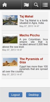
In the screenshot on the left you can see a sample category page in the mobile-friendly version rendered by the System template.
Layout and style
The mobile-friendly version has a lighter interface than the standard one as the main goal is to fit the content in a smaller screen and the user to easily browse the site via a touch screen. To achieve this Elxis changes some things on the way it works.
- Uses a mobile-friendly version of the current template. If the template doesn't have a mobile version the mobile version of the System template is used.
- Changes by force some parameters in the built-in extensions. For example if you have set the articles in a category to be displayed in 3 columns Elxis will change that to 1 column for the mobile version.
- Hides unnecessary things like print and send to friend.
- The frontpage generated by the Elxis frontpage grid now loads modules set to be displayed in module position mobilefront. So, if you want to display a module in the frontpage of your site's mobile-friendly version set it to position mobilefront.
- Hides modules usually shown in the left and right columns of the site. The System template uses 2 special module positions, mobiletop and mobilebottom (above the below the main page content respectively).
- Makes tables, forms and search simpler.
- Images open in new window and not in popup or lightbox windows.
The special site layout and style is mainly achieved by the mobile version of the template. As we already said if the current template doesn't have a mobile version Elxis uses the one from the System template. If you don't want this create a mobile.php file inside your template's folder, put the layout and style you wish and Elxis will automatically use it.
templates/simplicity/
index.php
mobile.php
The determine a developer if the mobile-friendly version actually runs should check the value of the ELXIS_MOBILE PHP constant. If ELXIS_MOBILE = 1 then the visitor sees the mobile version of the site. If ELXIS_MOBILE = 0 he sees the desktop one. All Elxis PHP contacts.
Display problems on some extensions?
Built-in extensions are mobile friendly. However if you use a third party extension (eg. a module) that is not, it might not be displayed good in the mobile-friendly version of your site. Our recommendation is either not to use that extension or tell the developer's extension to make it friendly to mobile devices. You can also set that module to be displayed in a module position available only in the desktop version. For instance if you set that module on position "left" it will be visible only in the desktop version as the mobile version uses only module positions mobilefront, mobiletop and mobilebottom.
What about plugins?
Not mobile-friendly plugins should either become mobile friendly or not affect the articles text in the mobile version. To do so the plugin's developer should check the value of the ELXIS_MOBILE constant and if it is 1 change his code. For instance to make plugin download not affect the text in the mobile version do the following.
